Chicken 5 Road brand identity

Chicken 5 Road is a 20-year-old spot in the river city of Wuhan. Its rich cheese burger, built around a fried chicken leg, has a sweet, smooth aftertaste, and the retro fries, cooked the way they always have been, still taste the way regulars remember.

Identity
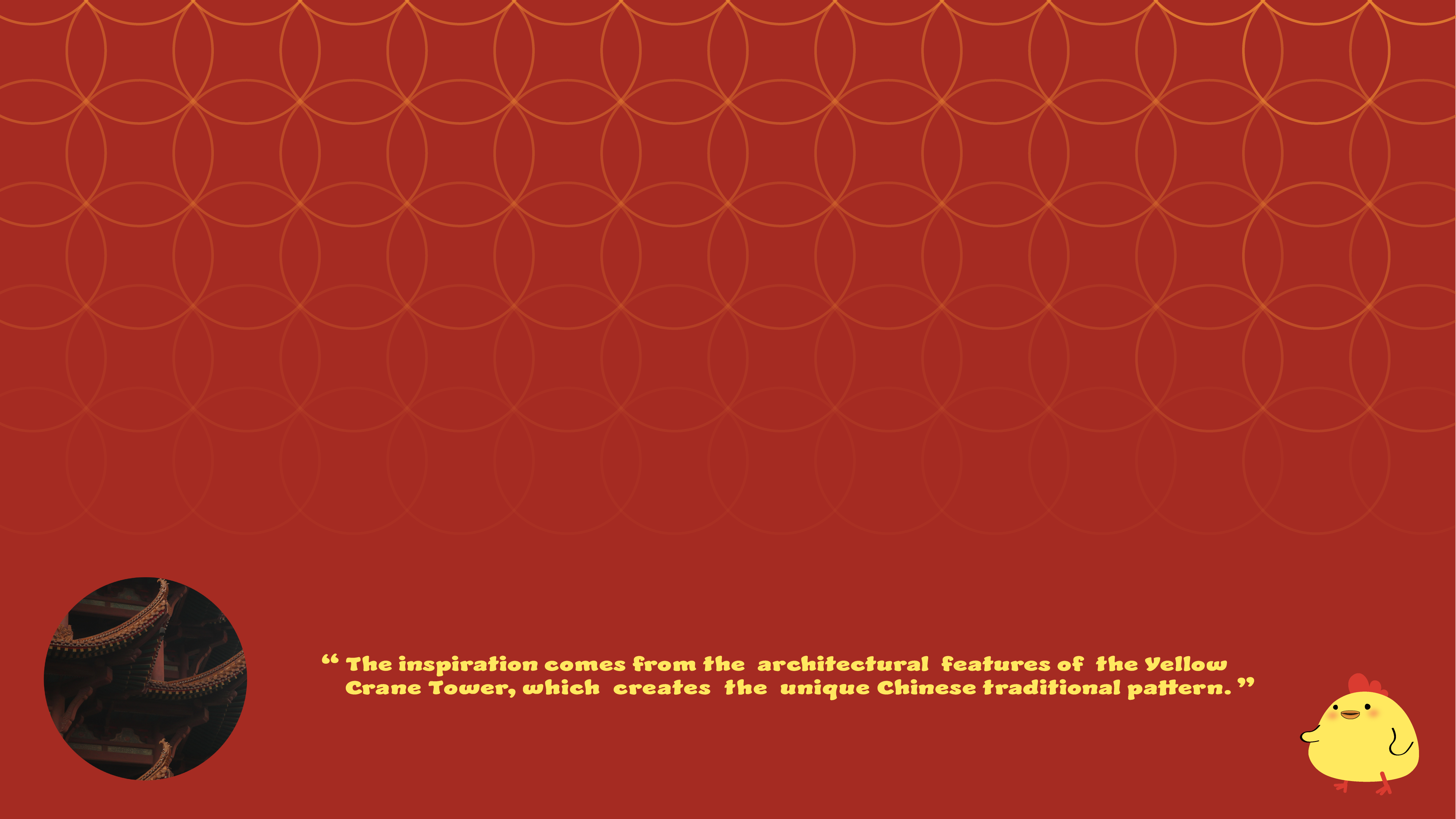
Design inspiration drawn from the Yellow Crane Tower
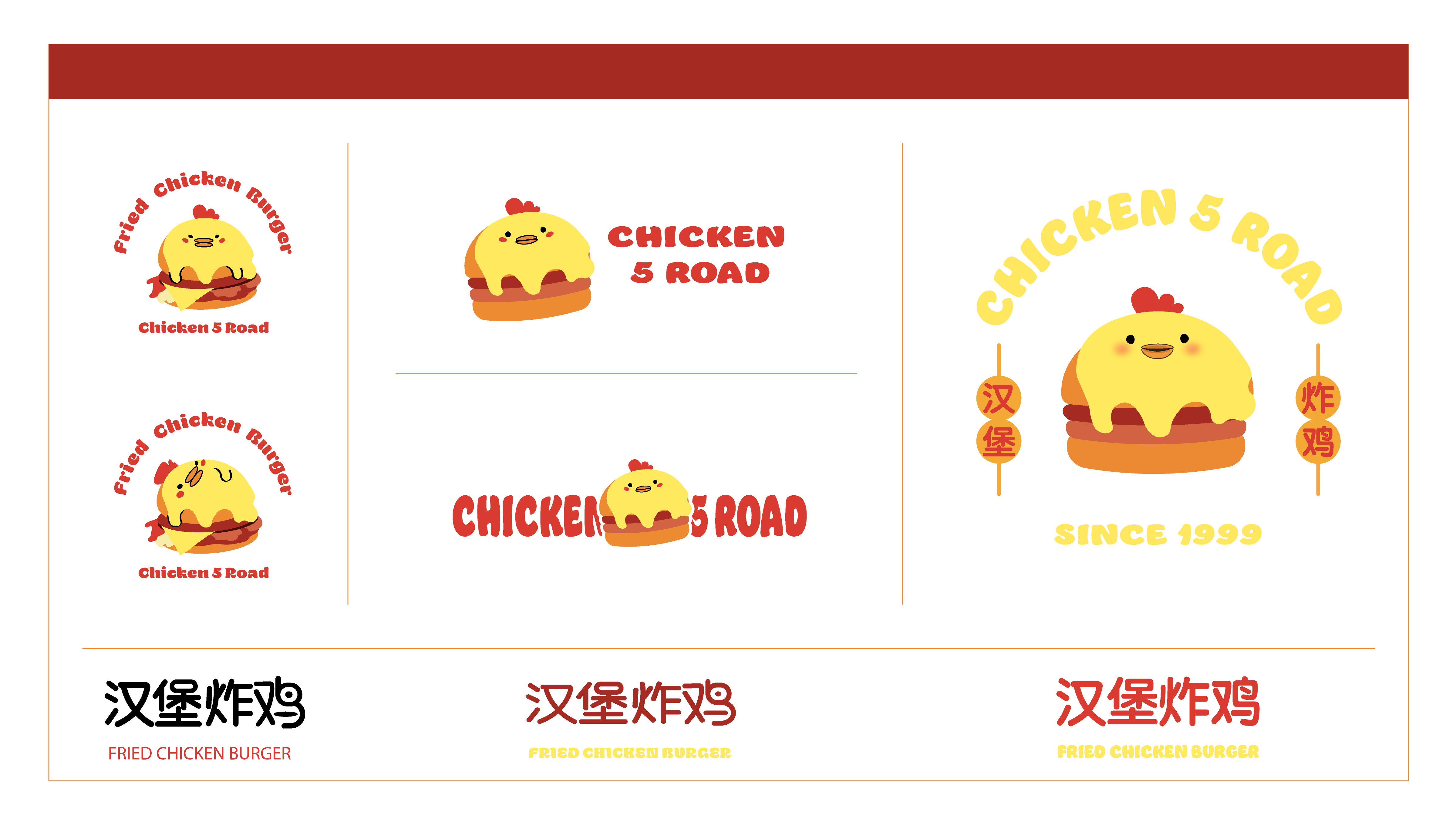
Chicken 5 Road logo lockups and wordmark variations
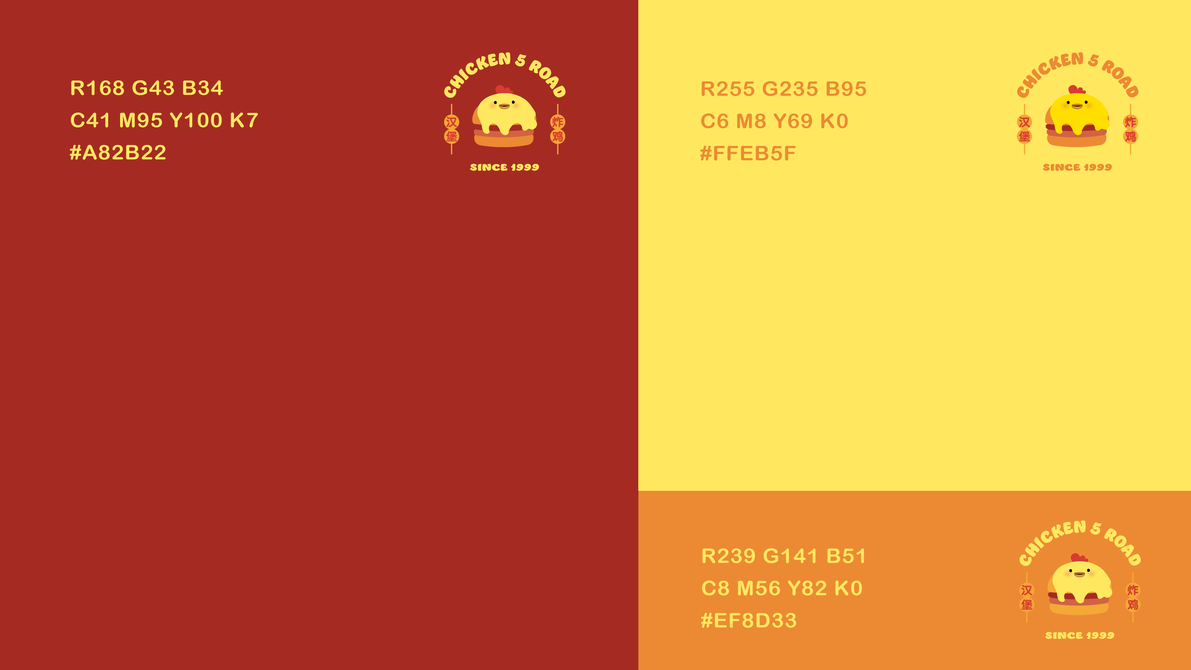
Brand colour specifications in CMYK and RGB

Fryer yellow on a deep braised red does the work: appetite first, brand second. A round, cheerful chick carries everything else.

Packaging
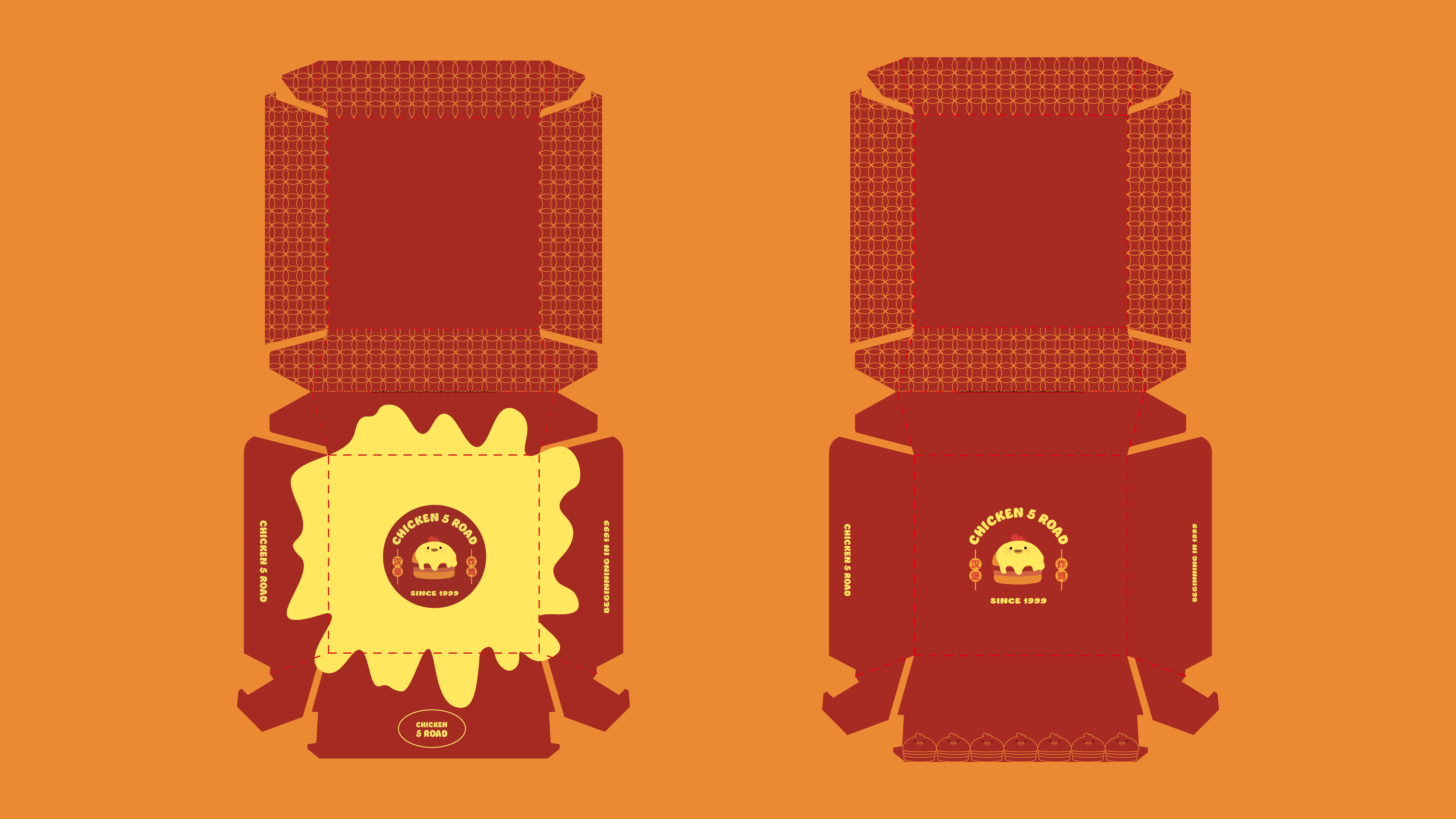
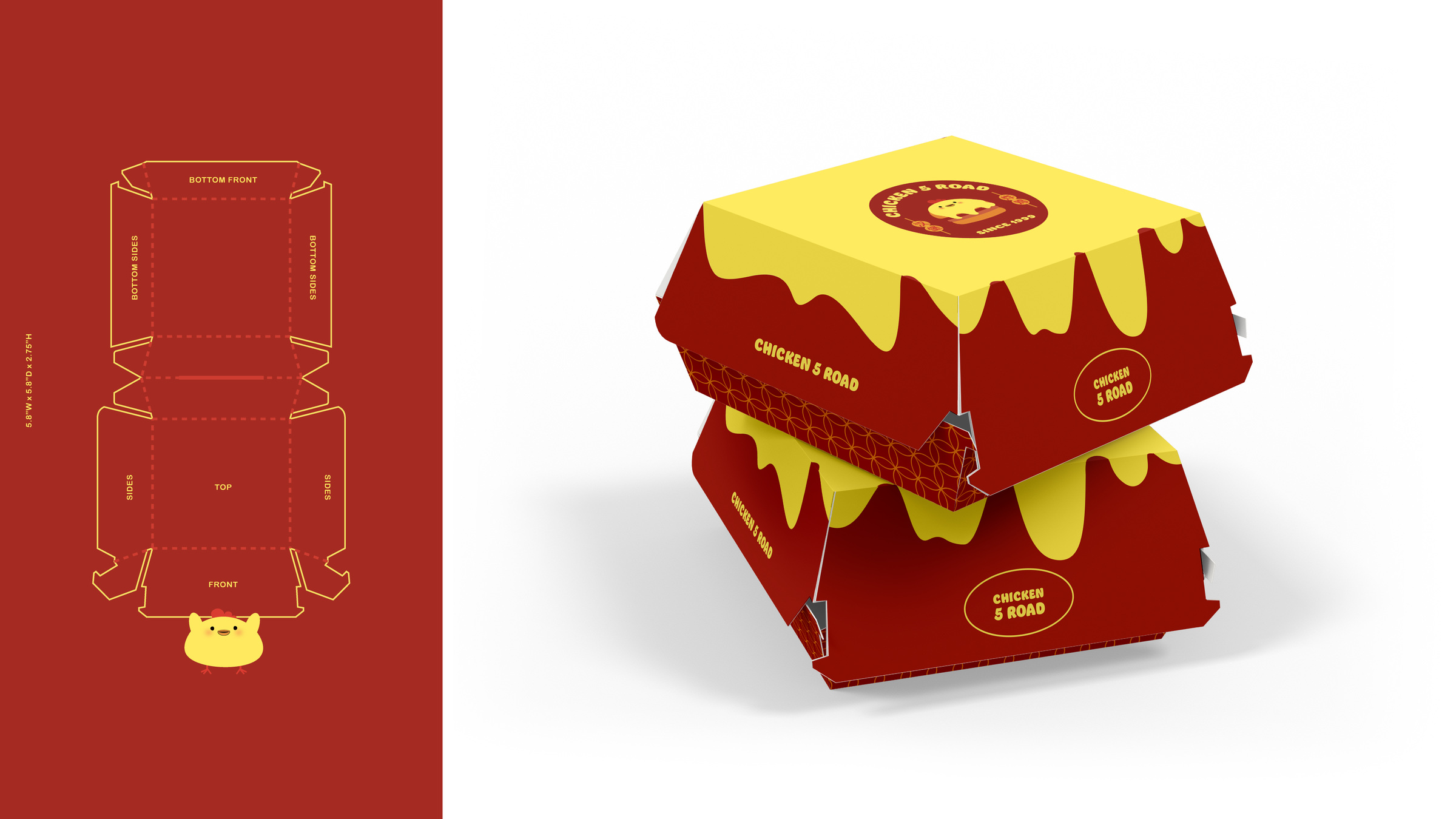
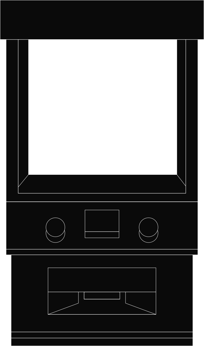
Packaging die-line structure
Burger box packaging
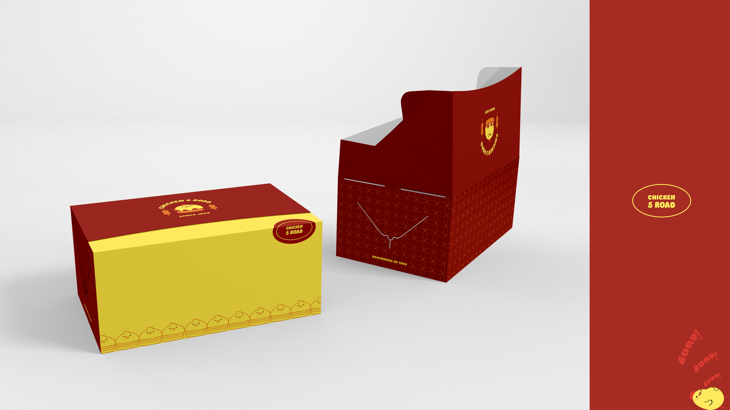
Takeaway carton and fries box
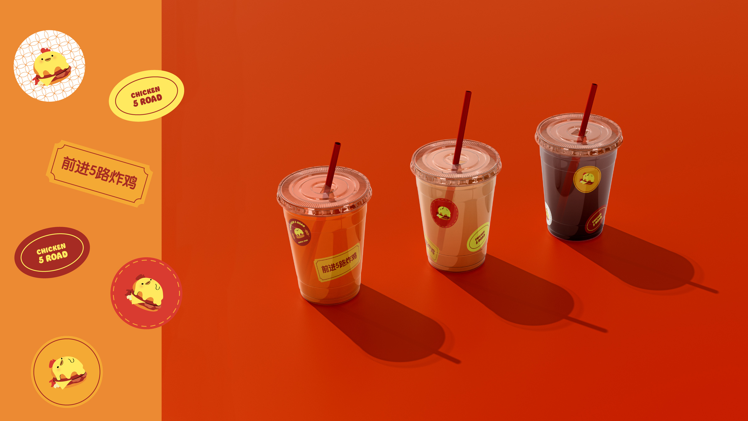
Drink cups and brand stickers
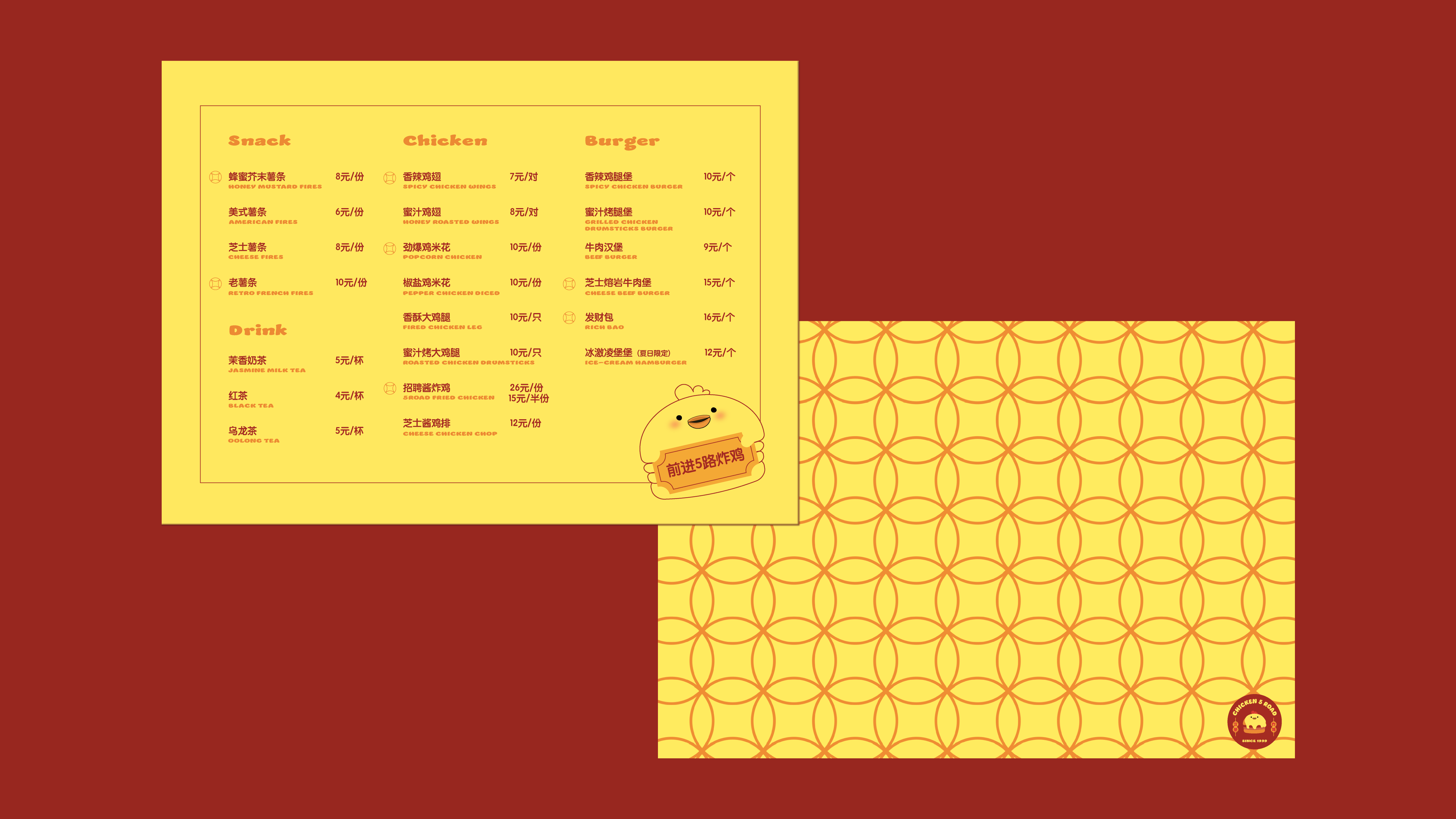
Menu design and pattern system

Applications

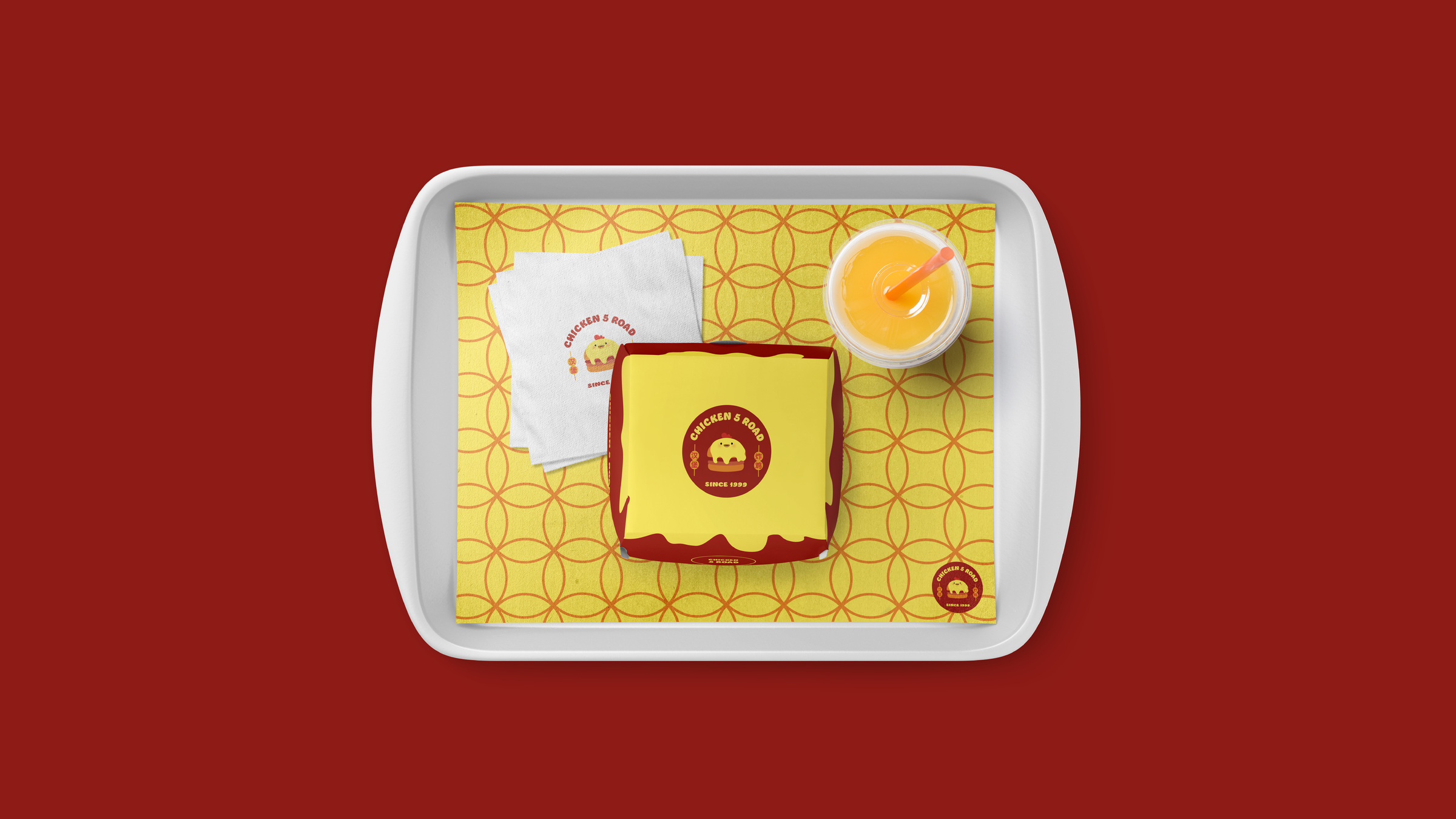
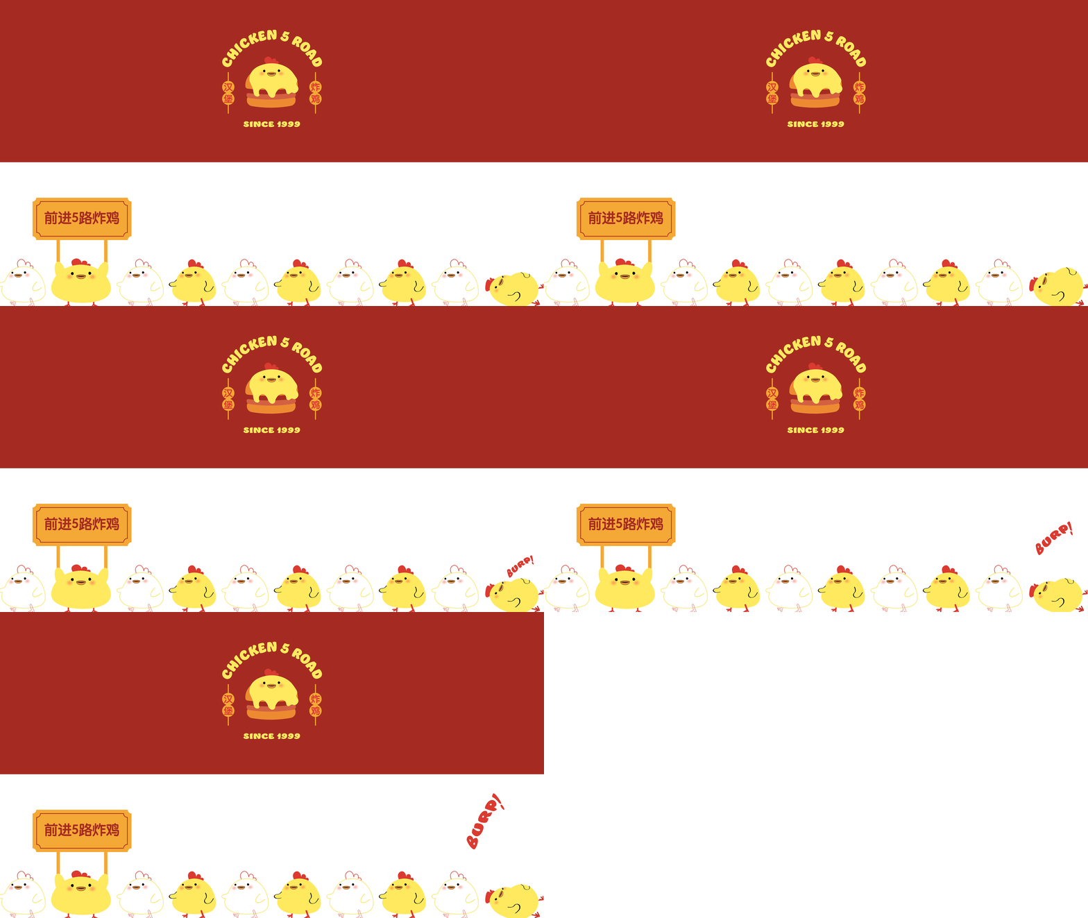
Tray liner and in-store serving materials
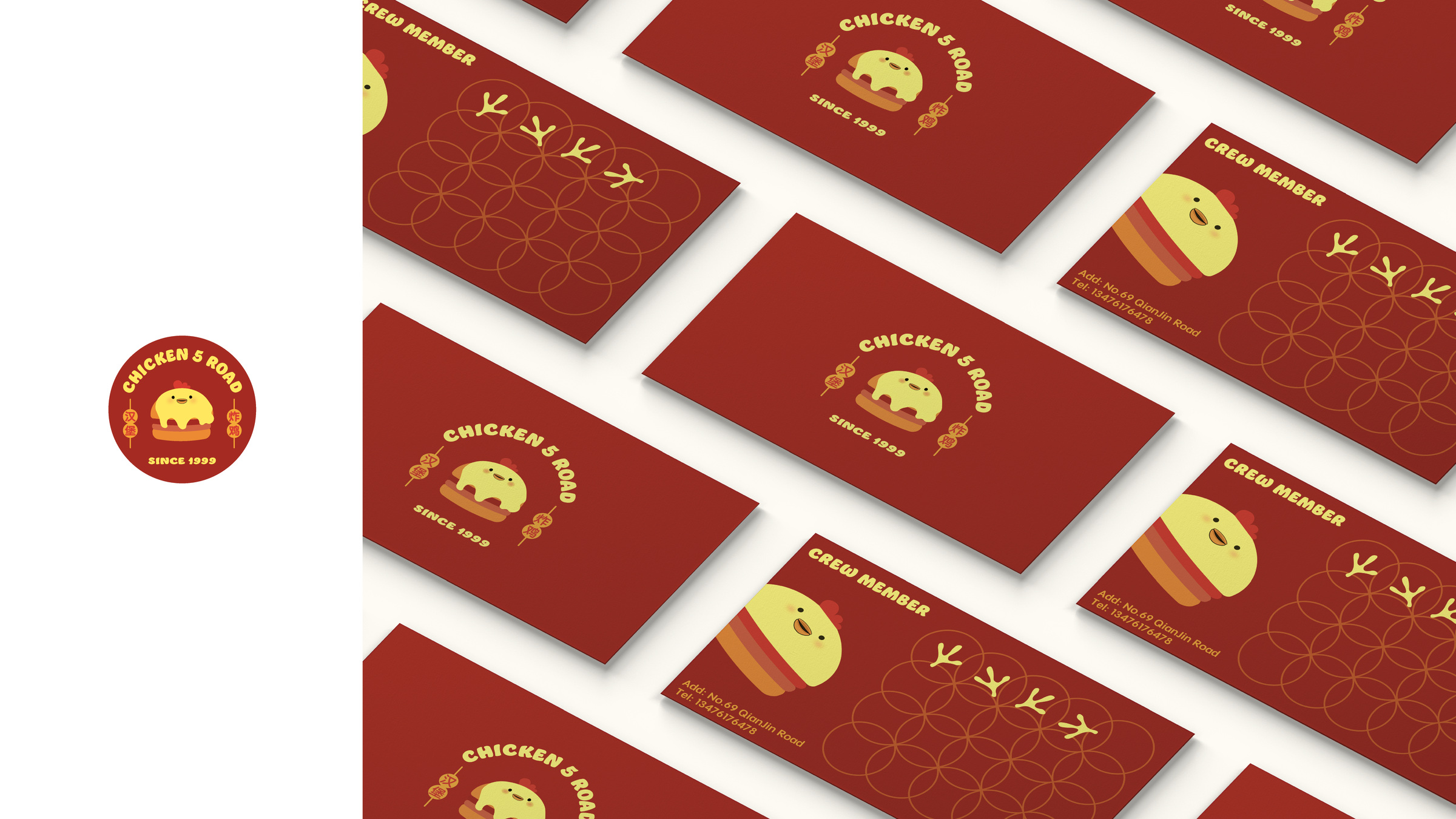
Business cards
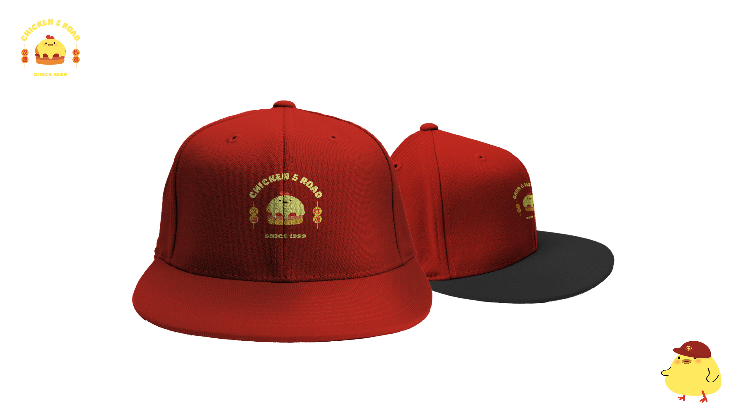
Branded caps
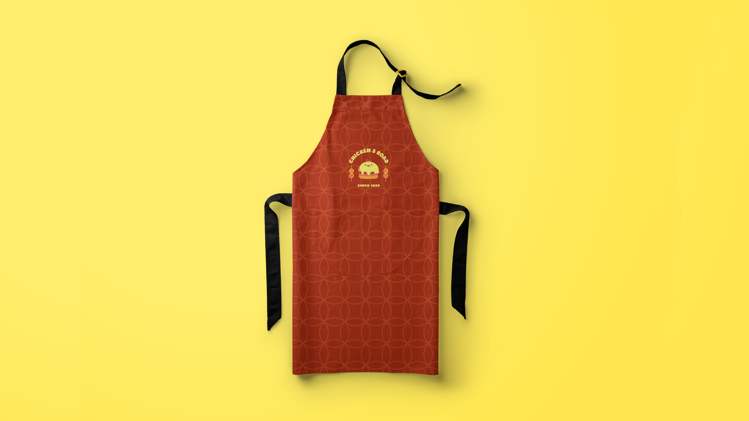
Staff apron
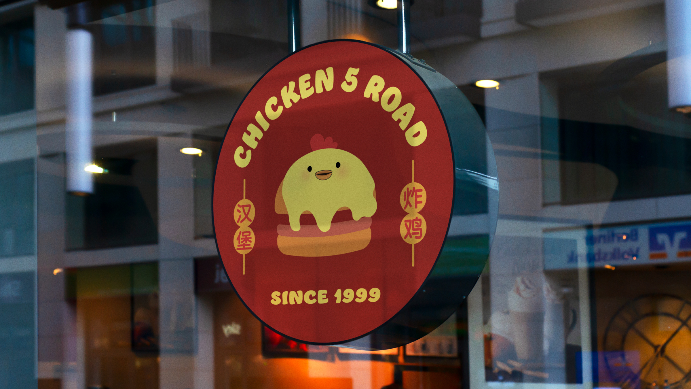
Storefront signage
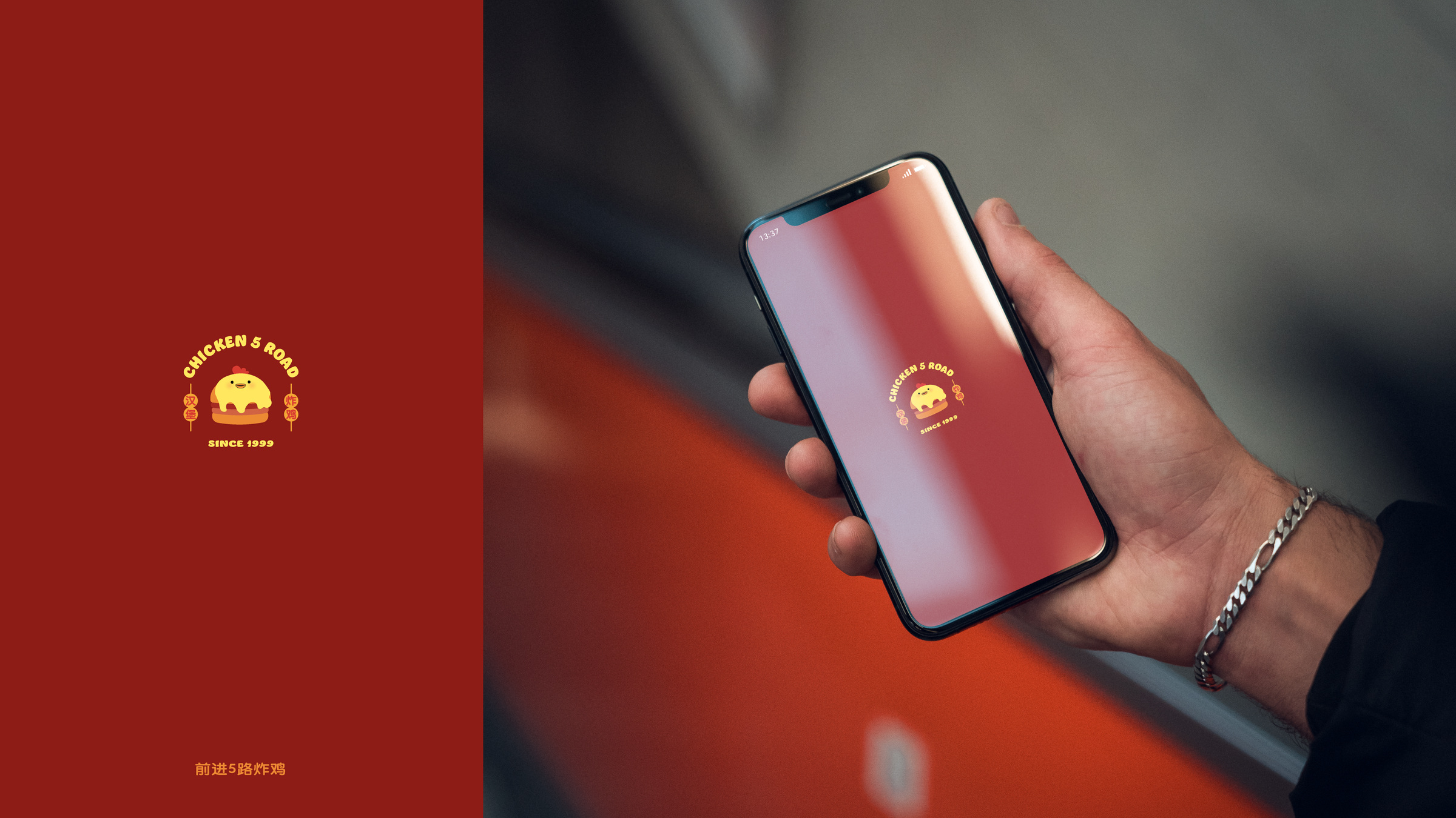
Mobile app launch screen
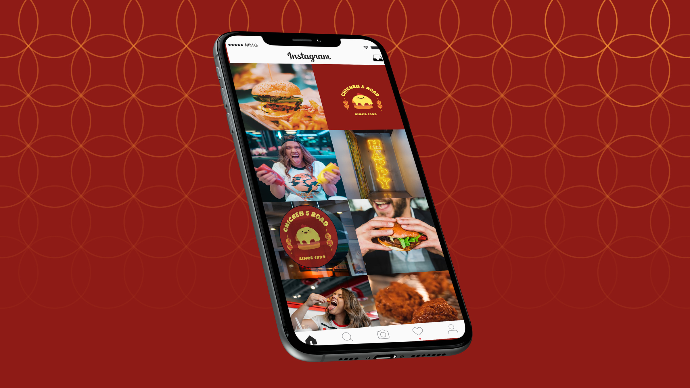
Social media presence

Working on something?

Tell me about it. I answer every message.

GET IN TOUCH ↗